
One might believe that numbers never lie if the corresponding calculations do not contain errors. And, objectively speaking, that is correct. But statistics alone can still deceive us if they show an incomplete picture of reality - or if we misinterpret them.
As humans, moreover, we are not particularly good at working with numbers and are much quicker and better at categorising visual representations. A quick glance at the chart of a share illustrates this impressively, compared to the alternative of tediously analysing the bare price data in an Excel spreadsheet for its trend. The figures may be more exact, but the rough classification of graphical representations takes only seconds.
However, even statistics are not always as exact as they appear to many, as Francis Anscombe showed in his study "Graphs in Statistical Analysis" published in 1973. In it, various examples are given that illustrate why graphical representations should definitely be included in the analysis in addition to pure statistics.
Anscombe's Quartet
A central problem is that statistics are based on assumptions. And if those assumptions are wrong, then the calculations based on them have no value either - or worse, they mislead us. The following graph appropriately shows the example from Anscombe's study.
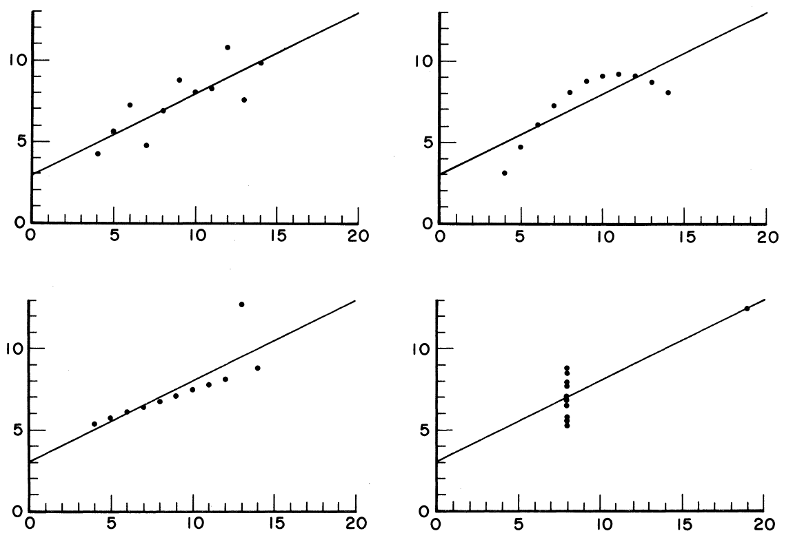
The individual diagrams show different distributions of data points (linear, non-linear, outliers). Before a statistical analysis, it should be checked visually whether the assumptions made are at all correct.
Source: Anscombe, F. J. (1973), Graphs in Statistical Analysis, American Statistician, Vol. 27, No. 1, pp. 19-20.
Obviously, the four data sets are very different. But the following fact is all the more astonishing: if one runs the raw data through a statistics program, identical results are obtained for the mean, the correlation and the regression equation.
It would be disastrous to base the interpretation solely on the statistics. Only a look at the graphical representation reveals that completely different interpretations are necessary for the individual data sets. The example shows how certain arrangements of data points produce misleading statistics and how individual outliers can extremely influence the result.
This principle can be applied to stock market prices. Many investors work with charts to get a quick overview of the price trend and, if necessary, to carry out further analyses. Very few rely solely on key figures, whether of a fundamental or technical nature, or at least prepare them visually as well. And for good reason: the combination of key figures and charts has proven itself in practice as "common sense" in the field of decision-making based on common sense.
Monty Hall
Another example where most people get it wrong is the Monty Hall problem. This was first described in a column in 1975, but has lost none of its fascination to this day. Because even experts who are very familiar with probabilities are regularly wrong here. Even then, following the publication of the solution, countless people came forward and said that the solution presented was wrong, including scientists with doctorates. But it was all correct.
The following diagram shows the initial situation. Suppose there is a lottery with three doors. Behind one door is the prize (a car), behind the other two are rivets (goats). We now choose a door at random, for example door 1. The moderator, who knows what is behind the doors, now opens another door, namely door number 2. Behind it is hidden a loser. Then he asks whether we would like to change our tip for winning door 1 to door 3 or not.
The crucial question now is: Would the change be an advantage?
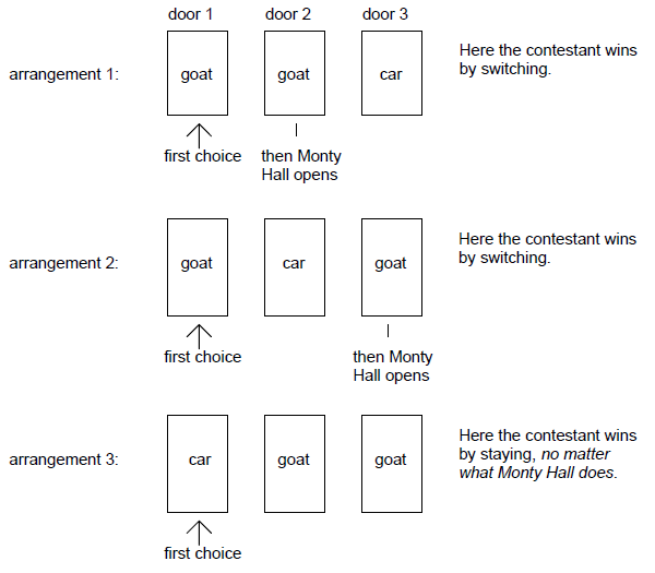
In two out of three cases, you get the prize if you change the chosen door.
Source: Krauss, S. / Wang, X. T. (2003), The Psychology of the Monty Hall Problem: Discovering Psychological Mechanisms for Solving a Tenacious Brain Teaser, Journal of Experimental Psychology General, Vol. 132, No. 1.
The answer: Yes, you should switch to door 3. Then the probability of winning is 2/3.
At first glance, it is difficult to comprehend. Intuitively, both door 1 and door 3 should each have a 50 per cent probability of winning, since door 2 has been revealed. But this is not the case.
The explanation: we had decided on door 1. So the moderator cannot open this one. Similarly, he cannot open a door that hides the prize, as the game would then be over. These restrictions now make door 3 more attractive compared to the previously equally distributed probabilities:
If the prize is behind door 3, the moderator can only open door 2 and switching is worthwhile.
If the win is behind door 2, he can only open door 3 and switching is worthwhile (in this case switching to door 2).
The only one of the 3 cases in which switching is not worthwhile is when the prize is behind the already selected door 1.
This means that in two out of three cases one wins by switching the door, i.e. with a probability of 2/3. So the initial intuition was indeed deceived here.
Compound interest effect
The classic effect where we as humans intuitively deceive ourselves is the "Eighth Wonder of the World" according to Albert Einstein, the compound interest effect. But can it really be so difficult to understand how it works? After all, you learn how to calculate it early on in school.
The problem is that it is practically impossible for the human brain, which thinks linearly, to correctly grasp exponential relationships. So knowledge alone is of little use if you have not experienced and internalised the immense effects yourself.
Here is another example: Let's assume we have a sheet of paper with a diameter of 0.1 millimetres that can be folded any number of times. Approximately how many times would we have to fold this sheet so that the resulting stack of paper would mathematically reach as far as the moon (average distance around 384,000 kilometres)?
The astounding answer: 42 times. And that would even put us "behind the moon". If you don't believe it, you can do the math: 0.1 millimetres x 2^42 equals about 440,000 kilometres.
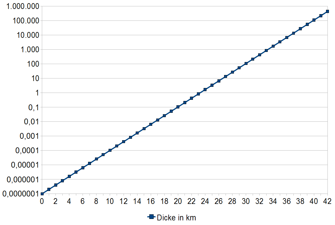
A 0.1 millimetre thin sheet of paper, folded 42 times, results in a stack of paper that reaches beyond the moon.
Source: author's own calculations
Similarly, if a chessboard has a grain of rice on its first square, the number on each square is doubled. Then the number on each square is doubled. For the last square with the number 64, the result is also only theoretical, because the amount of rice grains available worldwide has long been exceeded there.
Conclusion
It is always worthwhile to compare statistics and graphical representations and to interpret them in combination in order not to fall into a fallacy. But even common sense can deceive us, especially when it comes to exponential relationships. In this case, it is worth doing the math instead of following intuition.


